Climate and Biodiversity Stripes
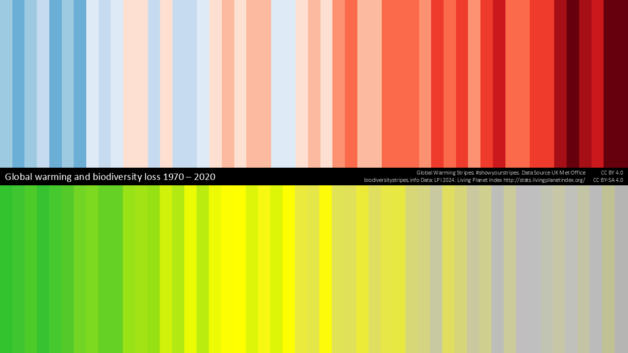
The post image above shows climate warming and biodiversity changes over time using colors to indicate the magnitude of change in a given year. This was created by Professor Ed Hawkins at the University of Reading in 2018. For the climate block at the top, the deeper reds indicate greater warming. In the bottom section, bright green indicates the highest levels of biodiversity, with yellow to grey showing decreasing levels, and darker grey representing more severe declines. This is a remarkable image summarizing a lot of detail while making a strong connection between global warming and loss of biodiversity.
The original biodiversity stripes were based on data from the Living Planet Index, which reveals that populations of mammals, birds, fish, amphibians, and reptiles have declined by an average of 73% globally since 1970. This global data covers over 30,000 populations of more than 5,000 species. The UK stripes specifically use data from the JNCC's UK biodiversity indicators.
Clean energy, sustainability, and climate tech jobs are where the rubber meets the road in the effort to decarbonize and reverse the losses in biodiversity. See below to find a job where you can be part of the solution!
What We're Reading


Staff Picks!



Internships




I continue to research, curate, and expand the number of companies on the list. These established companies and startups are doing truly amazing things related to solar, wind, hydrogen, energy storage, geothermal, carbon capture, low carbon materials, transportation and many others. Let me know if you have companies you would like to see added!



Member discussion